DEVELOP
Building the contents, planning the floor map
— MosCow
— Floor plan Ideation
— Floor plan Wireframe
— Emotional Flow Chart
— Visitors' emotional Journey Map
— Scene Dialog/ Visitors’ Script
— 5 key elements analysis on human emotions
MosCOW
— Games
— Loud noise
— Long paragraphs displays
— Screen for documentary video
— Comment board
— Wine table + couch area
— Speaker's stage
— Spring & summer collection
showcasing booth
— Growing plants, hashtag sheet
— Storytelling board
— Mingling space
— Photo booth
— Empty space
— Textile board
SHOULD HAVE
MUST HAVE
CAN HAVE
SHOULD NOT HAVE

CAN HAVE
MUST HAVE
SHOULD HAVE
IDEATION OF
EXHIBITION FLOOR PLAN
CRITICAL QUESTIONS
— What does "interactive" design actually mean?
— What is the good balance between digital and analog?
— What are the tools available to achieve the balance?
— What types of lighting do we implement to enhance our theme?
— How does the visitors emotions flow throughout the exhibition?
— What are possible conversations visitors would have in each section?
— How can biophilic design play a role within this theme of exhibition?
— What is the possible estimated time visitors would spend inside the exhibition?
floor plan
wireframe

VISITORs'
EMOTIONAL FLOW
05: CONCENTRATION
08: FURTHER QUESTIONS/
SHARE
03: CURIOUS/
BEGINNING OF UNDERSTANDING
04: REALIZATION
06: SECOND SURPRISE
07: THOUGHTS OUTPUT
02:
SURPRISE
Breathing time from concentration mode— visitor realizes of the mirror and bar, and starts to get out from concentration state with actions of taking pictures and getting drinks
Through screens to storyboard, visitor experiences the highest state of concentration, gets huge inputs and starts to feel deeper connection with the brand
Visitor begins to question more— leading to further conversations with others + opportunity for them to share on both online and real world
Visitor begins to come out from inner world within themselves, and begins to enjoy interactions with others— beginning of relaxing state once they enter mingle area
Visitor sees the hero collections + circular garden as soon as they go through the entrance, and feels the impact of collaboration of SS collections and green interior design
Walking into the collection displays, visitor starts understand the theme of the exhibition
01: WONDER/ QUESTION
Visitor gets intrigued by the
tagline on window display, walks in
to learn more
Looking into both circular garden and textural library— visitor comes into the realization of thought-out contents of exhibition
ELEMENTS THAT AFFECT ON OUR PHYCHOLOGY
COLOR
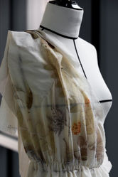
Colors extracted from their original sustainable fabric with eco-printing

TEXTURE
Real texture of growing plants, and nature inspired fabrics
TEXTURE
Real texture of growing plants, and nature inspired fabrics


FORM
Imperfect/organic forms, circular shape to signify the idea of "inclusiveness"
LIGHTING
Natural light x LED that changes accordingly with the time of the day


AUDIO
VISITORs' SCRIPT/
possible conversations
SCENE 01
FOR PRIMARY PERSONA:
ANNE (42)
EDITOR IN NY

Anne: Ummm… I could never thought the right movement for sustainable fashion that fashion industry are supposed to make, because this industry is one of the biggest mechanism of wasting resources…
Friend: Yeah.. but I was amazed how they printed extinct leafs on the collections. It’s very imposing.
Anne: I mean.. How they created this space and their each expression is absolutely one of unexpected ways of contributing to make people think about what’s sustainability. Especially from this label.
Friend: I think it must be a big challenge for Dior to try take on the sustainability through all of these fashions and displays that is always the criticized about how they waste the nature.
Anne: It’s really good to have such a high brand that I personally think is conscience and is at the forefront of making new reclamation of fashion.
SCENE 02
SECONDARY PERSONA:
BEN (27)
ARTIST IN SF

Ben: Did you expect Dior to do this?
Ben: Yeah me too. I wonder what their incentives were though to do this campaign— because I know it's risky for them to open up talks about sustainability in fashion!
Ben: Wooo! That's exciting. I feel like they are trying to move one step forward to be one of the solutions for the big global issue... the sophisticated sense and care for the ultimate beauty like this creation shows is I think their strength as Dior to do it.
Friend: Not really. It's interesting how they made recyclable materials look elegant with their execution...I quite like how natural they look
Friend: I was gonna say the same thing. Oh look, they hang the samples of fabrics they used in collection here... very beautifully crafted.
Friend: Agree. I'm interested in how other brands get inspired to move to the similar direction for their environmental values... but I'm most interested to see how artists like you get inspired by it for your next piece!
USE OF IPOP:
IPOP is a useful framework for building a content strategy and thinking about audience diversity and preference differences. The model names four dimensions of experience. Individuals are drawn to each dimension in varying degrees and usually have a dominant preference among the four:
-
I: Ideas — an attraction to concepts, abstractions, linear thought, facts and reasons;
-
P: People — an attraction to emotion, human connection, affective experience, stories, and social interactions;
-
O: Objects — an attraction to things, aesthetics, craftsmanship, use, ownership, and visual language; and
-
P: Physical — an attraction to somatic sensations, including movement, touch, sound, taste, light, and smell.


